Use Headings to Structure Page Sections
Use heading tags to emphasize important text

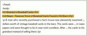
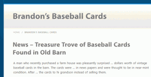
Heading tags (not to be confused with the <head> HTML tag or [tippy title=”HTTP Headers” reference=”” header=”on”]In HTTP (HyperText Transfer Protocol), different types of data that are sent off before the actual data itself.[/tippy]) are used to present structure on the page to users. There are six sizes of heading tags, beginning with <h1>, the most important, and ending with <h6>, the least important.
[clearboth]

Since heading tags typically make text contained in them larger than normal text on the page, this is a visual cue to users that this text is important and could help them understand something about the type of content underneath the heading text. Multiple heading sizes used in order create a hierarchical structure for your content, making it easier for users to navigate through your document.
[divider_padding]
Best Practices
[toggle title=”Imagine you’re writing an outline” variation=””]
Put some thought into what your main points and sub-points are; this is similar to writing an outline for a large paper. Then use headings to define and label each section appropriately. Headings should reflect the structure of each page and should not contain text that is not helpful to understand the structure. Do not use headings from a visual perspective only, simply to make fonts appear of different sizes. Use headings, emphasis (using <[tippy title=”em” reference=”” header=”on”]An HTML tag denoting emphasis. According to standard, it will indicate emphasis through use of italics.[/tippy]> tag), strong emphasis (using <[tippy title=”strong” reference=”” header=”on”]An HTML tag denoting strong emphasis. According to standard, it will indicate emphasis through use of bold print.[/tippy]> tag) and as appropriate.
[/toggle]
[toggle title=”Use headings sparingly across the page” variation=””]
Too many headings on a page can make it hard for the reader to scan the page and understand where one topic ends and another begins. Do not put all page text into a heading tag. Do not use heading tags to style text, use only to present structure.
[/toggle]
[divider_padding]
Further Study
Komotion: Typography examples – see how various headings are rendered if using a Komotion Web Pack (try free)